The Pareto chart area shows the plotted alarm event data. The bar type and grouping style will vary based on the Pareto chart’s settings. The chart header shows the start and end times of the report.
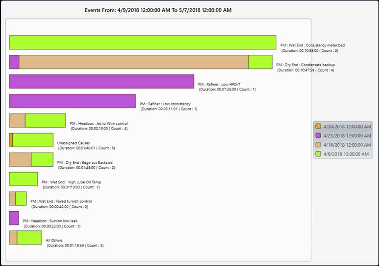
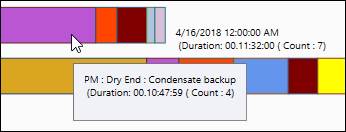
Hovering over a bar in the report shows more information in a tooltip.
If enabled in settings, the Legend explains the color coding of the bars.
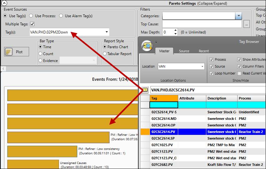
Add Tags
Add tags to the Pareto chart by dragging and dropping from Tag Browser or other displays. Tags dropped on the chart area will be available in single-tag mode (Event Source is Use Tag(s) and Multiple Tags is not checked). For all other modes, drag and drop the tag directly into the tag field in Pareto settings.
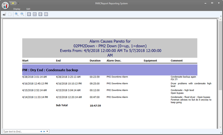
Launch Tabular Report
Click any of the bars in a Pareto chart to launch a tabular report with more detail.
Pareto Chart Right-Click Menu
Right-click the chart area to open the context menu.
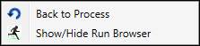
Back to Process: If the Pareto Chart is using a process area as the Event Source, the event data will first be grouped by tag. Then, if a user clicks on a tag’s bar, event data for that tag will be plotted. After that, if the user right-clicks the chart and selects the Back to Process option, the process area event data will be plotted again.
Show/Hide Run Browser: Collapse or Expand the Run Browser panel.