Fundamentally, PARCgraphics WPF-based displays are composed of XAML elements. In the PARCgraphics Designer, they are also referred to as controls.
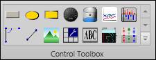
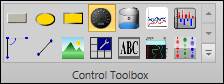
The 14 most frequently used controls are shown on the ribbon bar.
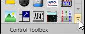
To see the full collection, click the expander button.
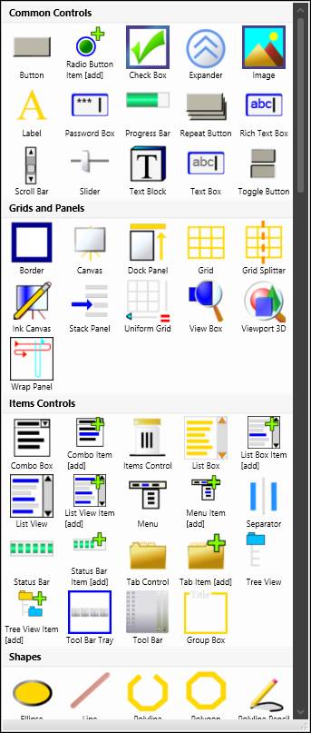
In the expanded view, controls are grouped by category. Scroll down to view all controls.
Controls can be added to a display either by drag and drop or by drawing. To drag and drop a control onto the canvas, click and hold on the control. Drag the cursor over the canvas. Let go of the left mouse button to drop the control.
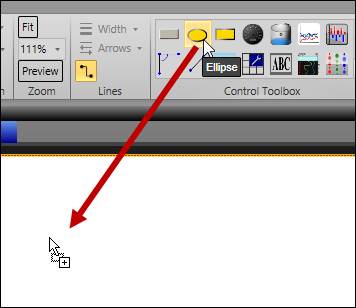
To draw a control, click on its icon. Notice the selected control stays highlighted.
The cursor will now appear as a crosshair  . Click and drag on the canvas to draw the control.
NOTE: Some controls are drawn using multiple clicks, for example to define segment points. To exit drawing mode, right-click or press ESC.