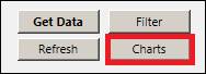
Data can be put into charts, such as Trend, Histogram, or X/Y plots directly from Excel. These charts are not PARCview charts, but Excel charts. Click on the Charts button in the settings pane.
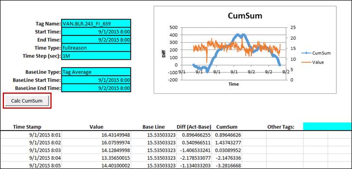
Click on the desired type of chart in the popup window. For Histogram, Trend Tags, and CUSUM, a column must be selected before clicking this button. For X/Y Plot, two columns must be selected.
Histogram: Produces a chart on the current sheet that shows the distribution of different values.
X/Y Plot: Produces a scatter plot with a linear fit comparing two tags. By default, the leftmost tag will be set as Y.
Trend Tags: Produces a plot of the tag’s values over time, much like a Trend in PARCview.
Cross Corr: Produces a new sheet that cross correlates all columns to determine which values are correlated. See below for more information.
CUSUM: Creates a new sheet that displays a data table and chart of the cumulative sum of a tag over the time period specified in the sheet. Modify the parameters in column B and click Calc CumSum to recalculate.
MSR: Produces a chart of the Maximum Sustainable Rate at a specified percentage.
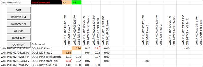
Cross Correlation Chart
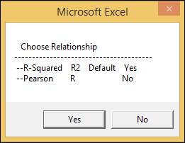
Upon selecting this chart, select Yes or No to select the desired relationship.
The data that results from this is the slope of the linear fit line produced after making an X/Y plot of all the data points for those two columns. The cells are formatted to change color based upon certain correlation values.
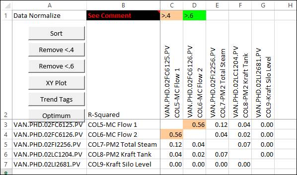
There are also buttons that manipulate the data displayed and create new plots. Click See Comment to see button descriptions within the sheet. Besides XY Plot and Trend Tags, these actions cannot be undone without creating a new CrossCor sheet.
Sort: Sorts the rows within a selected column in order from highest correlation value to lowest.
Remove <.4: Removes rows and columns where all correlation values are less than .4.
Remove <.6: Removes rows and columns where all correlation values are less than .6.
XY Plot: Creates an X-Y plot of the two tags from the highlighted cell. This chart is identical to the X-Y plot produced from the normalized sheet.
Trend Tags: Produces a plot of the tags’ values over time, much like a Trend in PARCview. This chart is identical to the Trend Tags plot produced from the normalized sheet, and will contain trends for both tags from the selected correlation cell.
Optimum: Shifts the timestamps of each tag relative to the others to find the best correlation between tags. Often there will be a time delay observed in a correlation. The maximum Interval Shift must be specified.
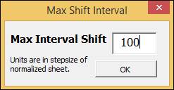
The time shifts will be displayed in new columns and the correlation values will be adjusted.